My thoughts about this program is that it is pretty cool. I found the easiest part was the black and white because she did not talk as fast and you do not have to do as much. The difficult part about this was layer styling. I think that because there is a lot of stuff she went over and she went way too fast so I got lost pretty far in too. I enjoyed photography enhancements more because they look really cool. The best thing about that is putting two pictures inside one picture and enhance that. You can make some pretty cool stuff. My favorite filter was the colored pencil. You can make the front picture like a painting looking thing, but the background a nice original picture. That looks really cool to me. It looks like a post card and those are usually really cool. When using the clone stamp, it is better to click rather than drag because it is easier and faster. Feathering is pretty cool, it softens the edges and makes the picture look really pretty. I edited two pictures that used 6 tools in total, three tools on each picture.
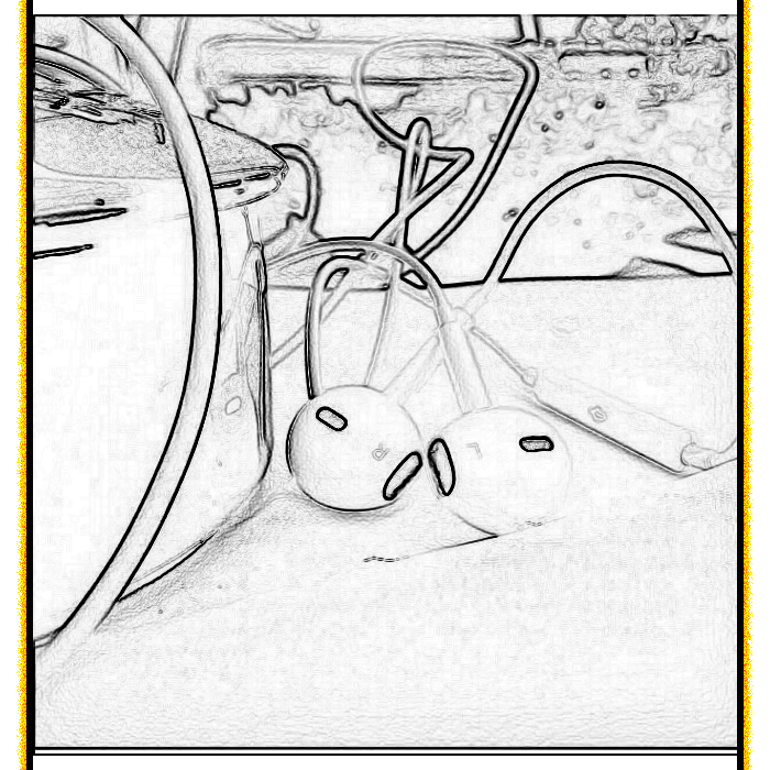
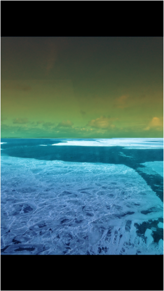
For the headphones picture, I started using the layer style, making the edges of the picture fire. Next, I used the effects tool, the effect was trace contour. Lastly, for this picture, I used an enhancement, The enhancement I used was converting the picture to Black and white. For the picture of the lake, I used the smart brush tool and made the water brighter by making it a lighter shade of blue, and made the sky a little bit darker like a sunset. Next, I put gaussian blur up too 61.4 where I thought the picture looked the best. Lastly for this picture, I used the spot healing brush and brushed it across the water to make it look pretty.
For the headphones picture, I started using the layer style, making the edges of the picture fire. Next, I used the effects tool, the effect was trace contour. Lastly, for this picture, I used an enhancement, The enhancement I used was converting the picture to Black and white. For the picture of the lake, I used the smart brush tool and made the water brighter by making it a lighter shade of blue, and made the sky a little bit darker like a sunset. Next, I put gaussian blur up too 61.4 where I thought the picture looked the best. Lastly for this picture, I used the spot healing brush and brushed it across the water to make it look pretty.
 |  |
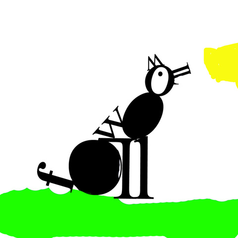
This is my Typography of a wolf. The letters I used were lowercase f, two l's, and uppercase two W's, four O's and two L's. If you noticed, the letters I used spelled out wolf and the picture is a wolf. That is really cool!!
 RSS Feed
